Wenxuan's Portfolio Room
Other IRL projects.
A selection of my finest.
To reach me or to just say hello, email [email protected]
The Great Big Rescued Food Cook-off 2023 poster

I made this poster during my internship with Waiheke Resource Trust. I was tasked with creating promotional collateral for their event. I communicated with my supervisor at each stage of the design process so I could deliver exactly what they want.Since this event is a competition, I decided to have two opposing characters. To convey the friendly nature of the competition, I also gave them happy expressions and oversized chef hats and utensils.For the background, I used one of WRT's signature greens. Line icons of different food products are used to give more interest to the top half. These are also reminiscent of the line icons that permeate the WRT branding.


Auckland Lantern Festival poster

I made this one when I was studying at Whitecliffe. The brief was to remake a previous project. I chose a horrible lantern festival poster I made right before this one. Needless to say, my original attempt was torn to shreds during critiques.For the remake, I made it a point to minimise repeated information. I also made sure there was a comfortable margin between elements and that the information was actually readable.The original poster was quite shallow in terms of representing the lantern festival. I literally just drew a bunny lantern and called it a day.For me, the main attraction of the lantern festival has always been the food stalls and the festive atmosphere. The lanterns were just a nice bonus. So, for the new illustration, I focused on showcasing those aspects of the festival.
Christmas themed pattern

A Kākāpō Santa and its Reindeer Elf Assistant delivering gifts.The design features three scenes - checking the recipient list, transporting the gifts, and presenting the gift.This idea began when I realised that the Kākāpō’s nostrils reminded me of the little round glasses you sometimes see Santa wearing. Plus, its rotund build and friendly appearance only further solidified the Santa comparison in my mind. The rest of the design just snowballed from that.I wanted the pattern to have a hand-drawn children's book vibe.I made this for the Resene wallpaper competition. But now that I think about it, who would actually want a christmas wallpaper? You'll have to look at it all year round!
AUT Sustainability Collab logo

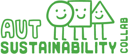
This was a comissioned logo for the AUT Sustainability Collab.They wanted a friendly and inviting logo that also represented the three pillars of sustainability (environmental, social and economic).I decided to incorporate a mascot (or three!) into the club logo. Three universally recognised shapes united by similar facial expressions and stick legs. I wanted to give the three (admittedly dull sounding) concepts a touch of humanity and cuteness.The use of the rough Santa Rosa typeface and hand-drawn aesthetic is meant to empasise the down-to earth nature of the club.
I got the Clicksplosion clicking effect from this webiste!